Online Webinar Tool

Product Design
Project Overview
Wistia Live is a game-changing webinar platform that seamlessly blends scheduling, hosting, and event analytics. Wistia Live is redefining the virtual engagement experience for marketers, speakers, and audience members by harnessing the power of user-centric design and strategic project management.
My Contributions
While working on the project, I helped create our first roadmap for a product within Wistia and helped train designers on how to transition from Sketch to Figma. I created a prototype for design to use annotations when handing off designs to engineering. This helped eliminate miscommunication in interactions within a design project. As design lead, I wrote many design tickets for other designers who worked with me on the project.
User-Centric Design: Develop an intuitive and visually appealing interface that caters to the needs of both novice and experienced webinar hosts, ensuring a seamless and enjoyable experience for attendees.

Efficient Webinar Management: Implement robust project management functionalities within the platform to enable marketers to plan, execute, and analyze their webinar campaigns effortlessly.

Scalability and Customization: Design a tool that accommodates the diverse needs of marketers, speakers, and audience members, allowing for scalability and customization to align with different marketing strategies and engagement preferences.
Objectives
Personas were created to help us remember our users' needs and goals. These are essential in ensuring that the produce  effectively targets and address the diverse needs of the marketer and audience member. By developing detailed personas, the team gained a deeper understanding 
of our users' challenges, preferences, and goals.
Persona
Marketers have many things to manage during a live webinar event. They need to add panelists to the stage, monitor the chat, and post poll questions to engage the audience. It's easy to become overwhelmed if the interface is not smart and intuitive.

After conducting a competitive analysis, I arranged the control room (event room) for the webinar in a way that enables the host to easily access and view primary functions. This structure was also designed to accommodate additional features that we anticipated would be added to the system in the future.
The Event Room
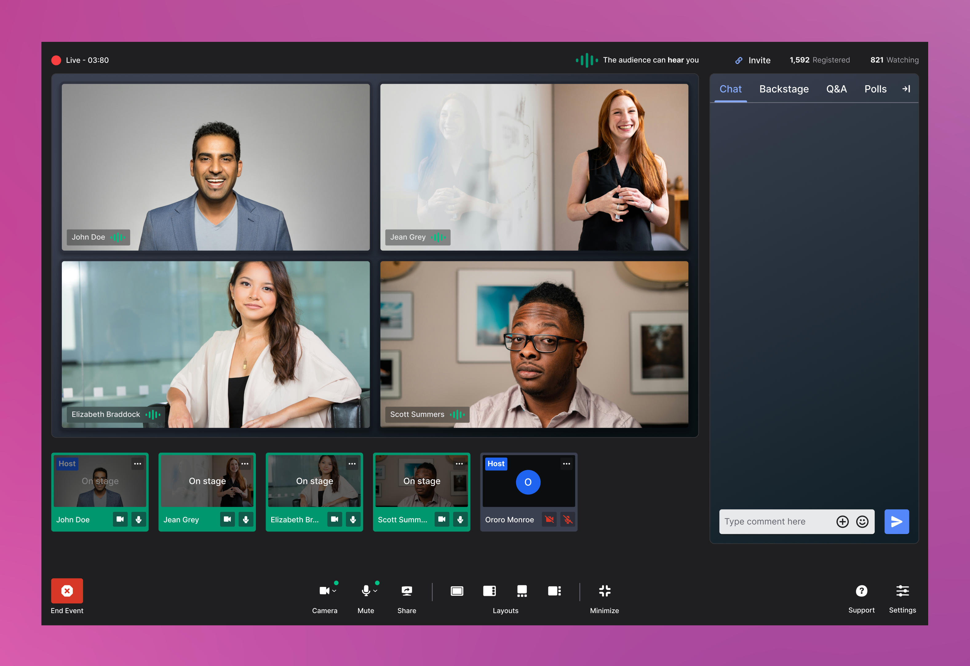
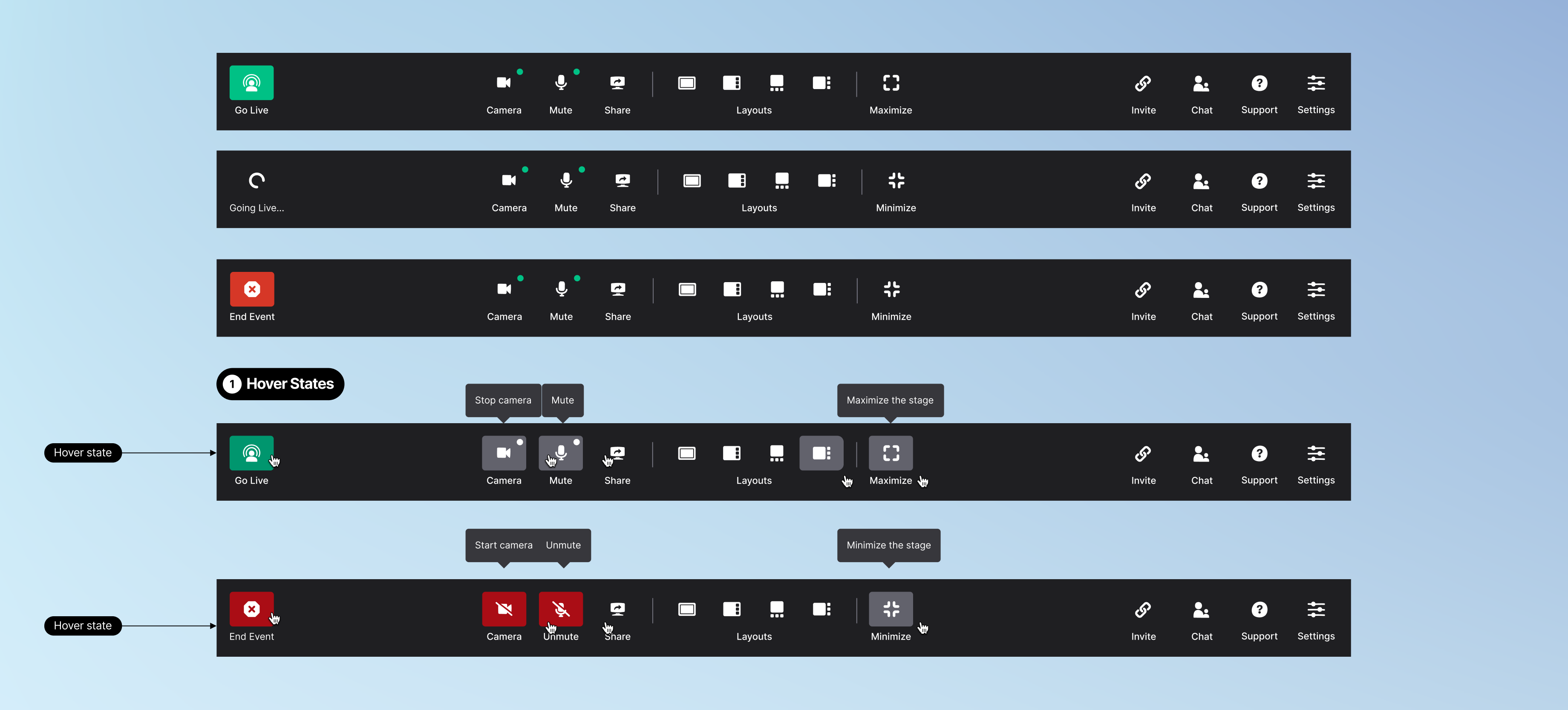
Using communicative iconography coupled with text and alt text for accessibility, we layer out our toolbar by the level of priorities. Starting the event, it is placed to the far left, so a user must actively search for it. This prevents them for accidentally recording their event before they're ready. (Of course, we have a confirmation modal, just in case someone accidentally clicks this button.)

Controls for the stage and your personal audio and video states are centered. It is easily accessible because they will control what the host's audience experiences.

Support, settings, toggles for the chat, and invitation links are placed near the edge of the screen where their actions take effect.
The Toolbar
During the course of this project I devoloped pages that support the webinar hosting experience. These include a camera setup page, and the registration page for audience members.
Supporting pages

Learn More

A mixture of all the Ninja Turtles 🐢 into one. Suffering from an addiction to coffee, cookies and zombies 🧟. Team player, a negotiator with developers, product owners and stakeholders.

Download Resume
Experimentation,  concept designs, digital art.
Writings on design and case studies. Some fun stuff as well.
Resume, work history and professional correspondence.

Want to get in touch?
Drop me a line!

Thank you! Your submission has been received!
Oops! Something went wrong while submitting the form.